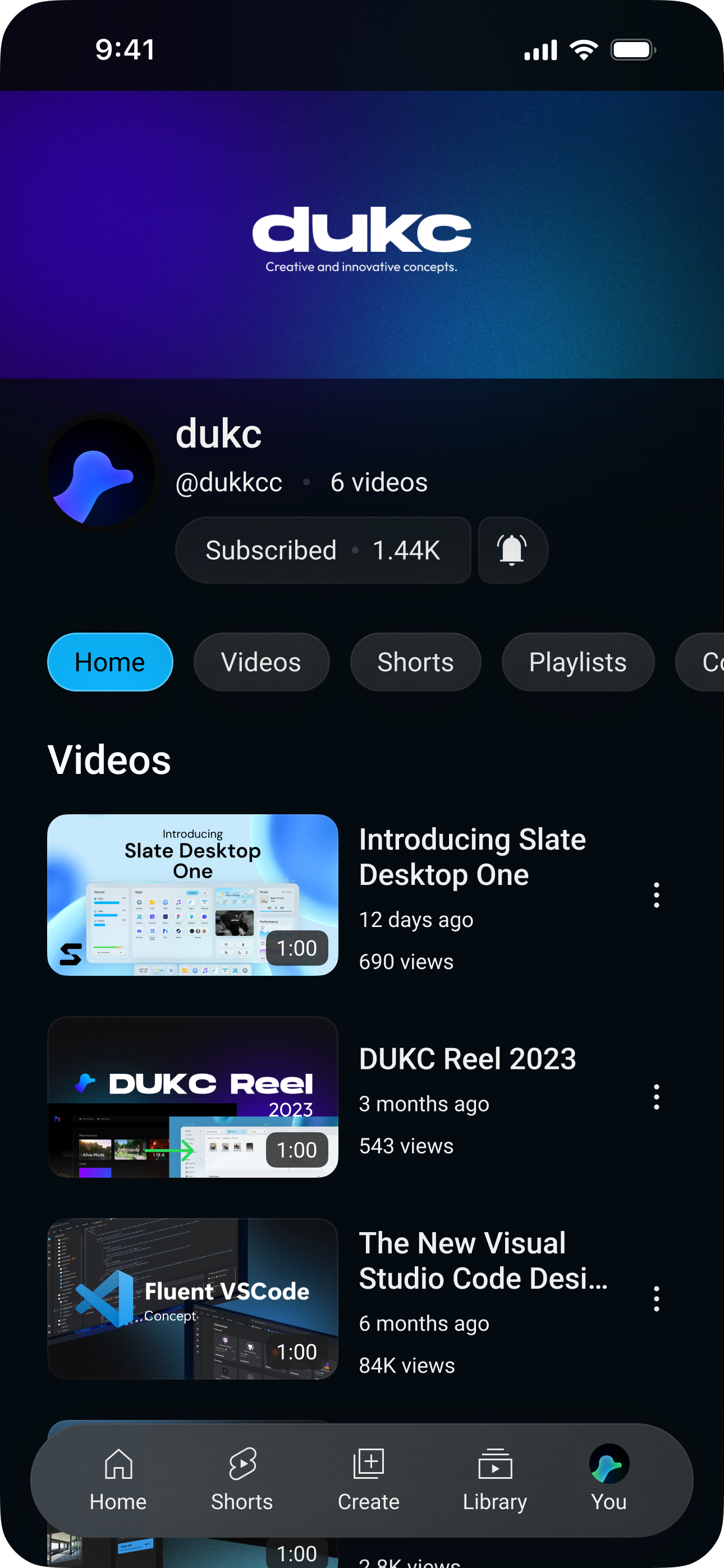
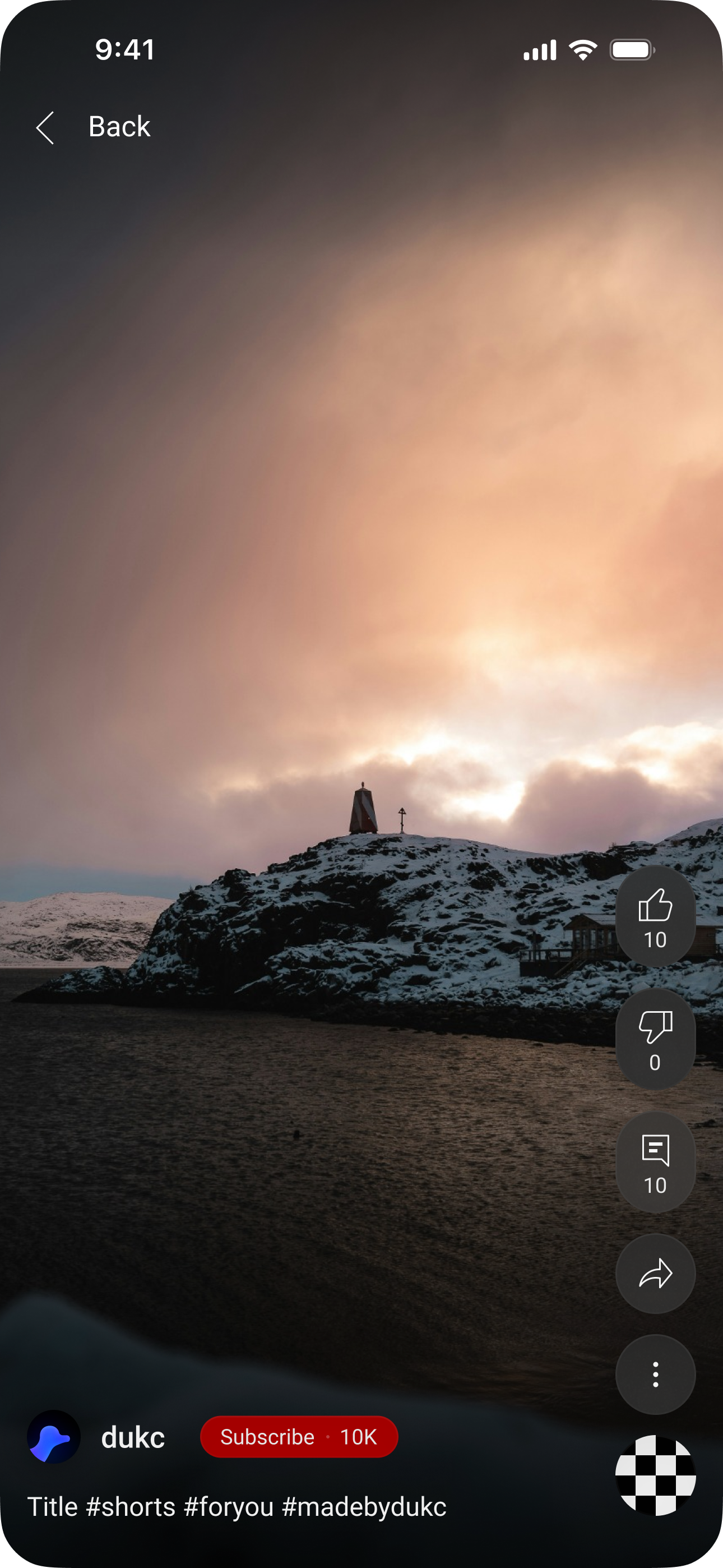
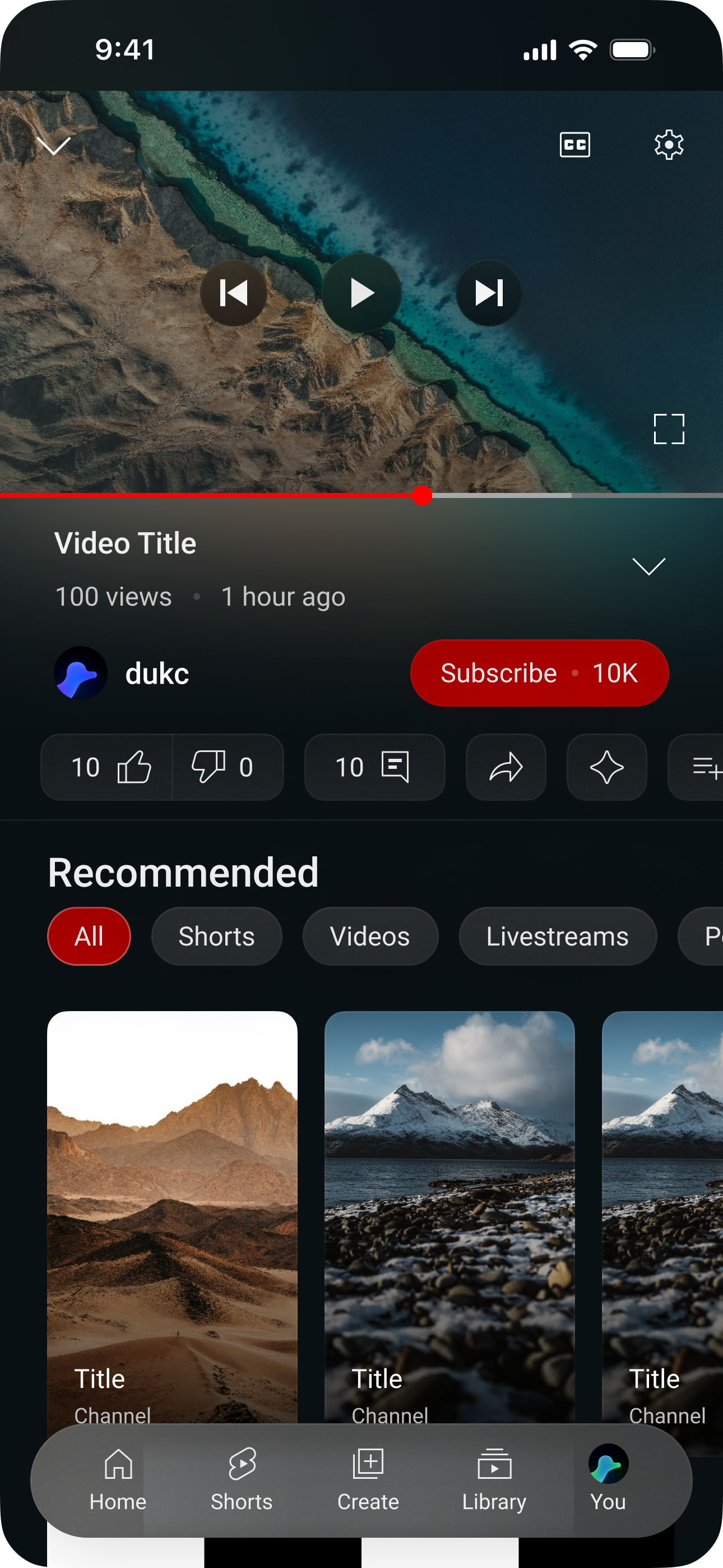
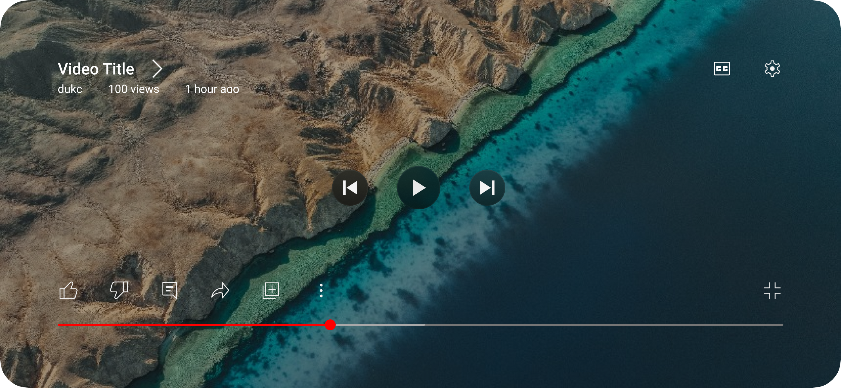
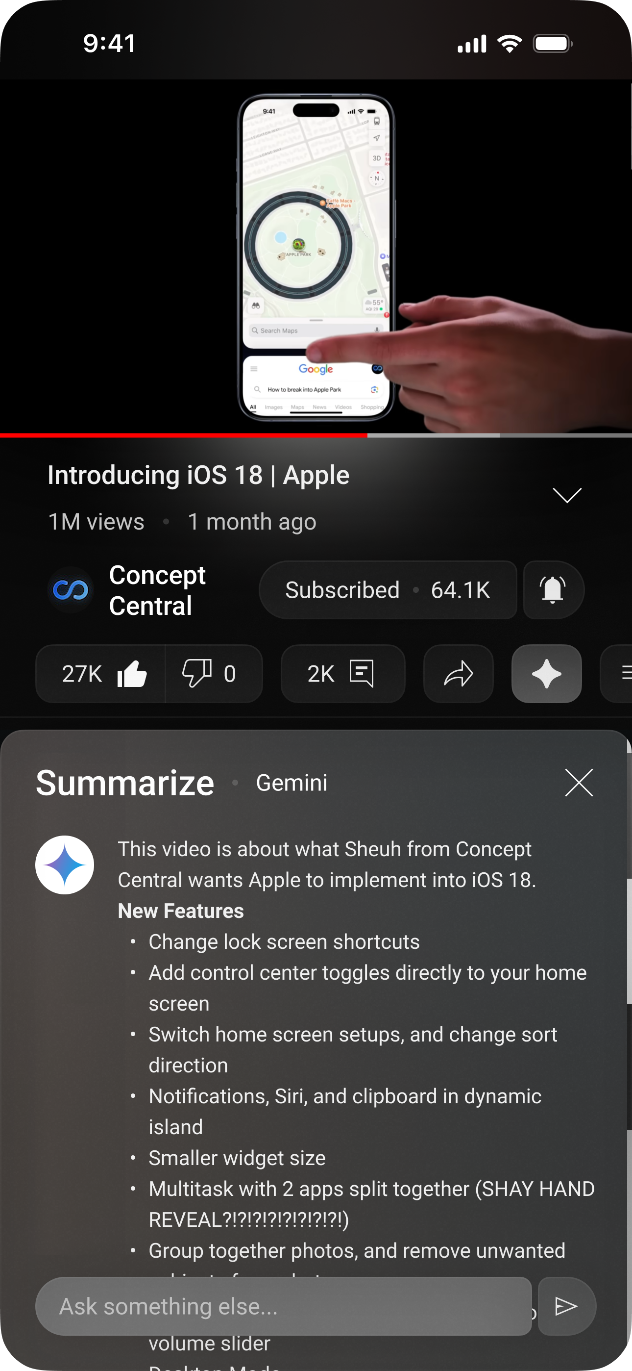
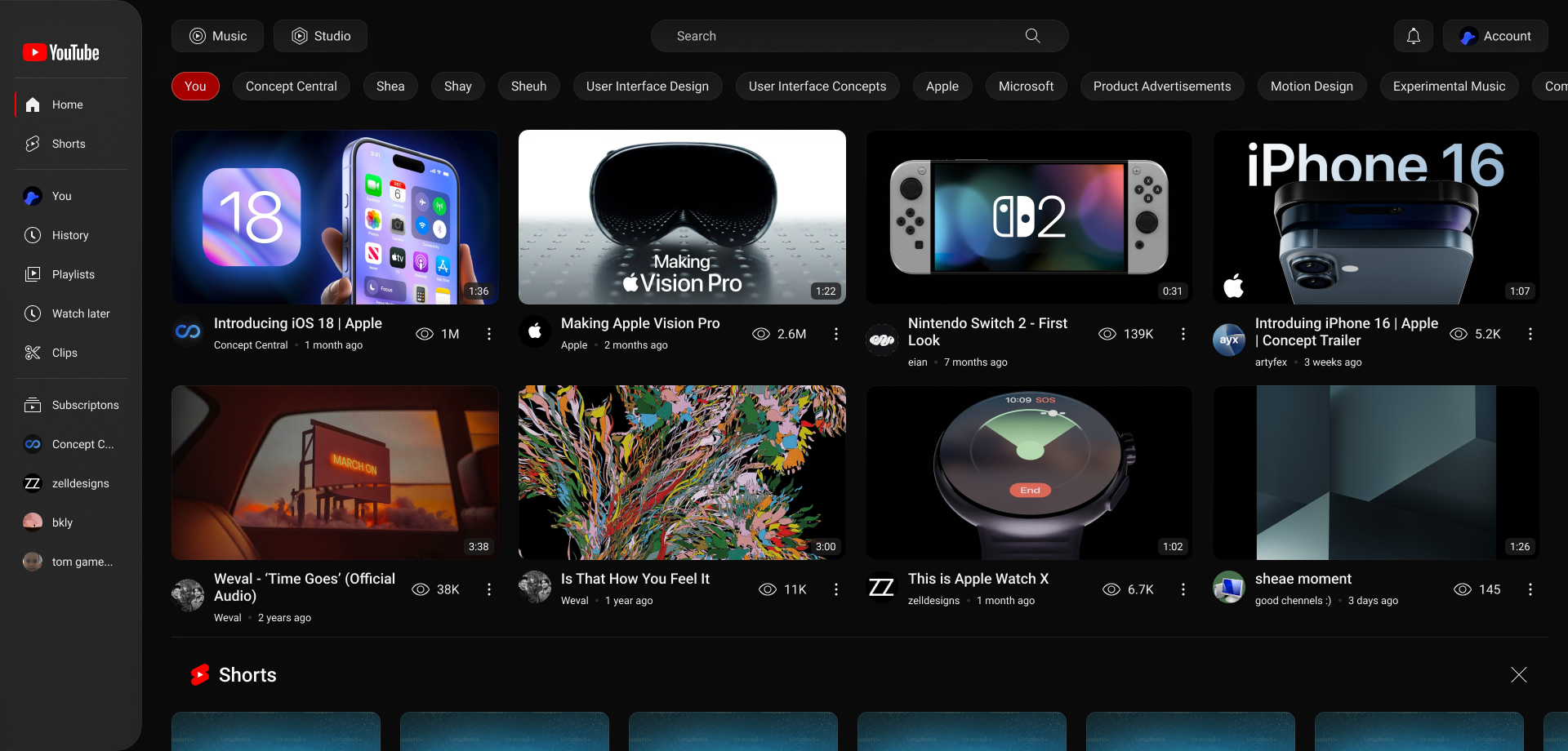
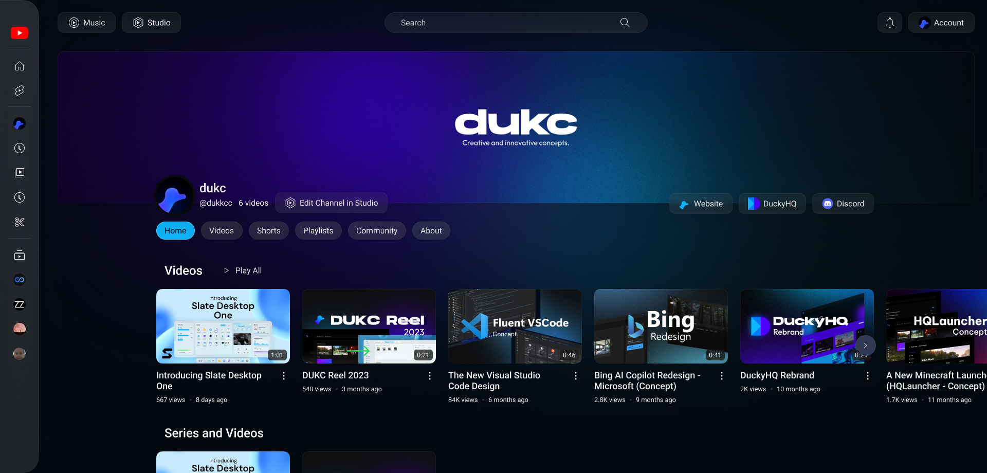
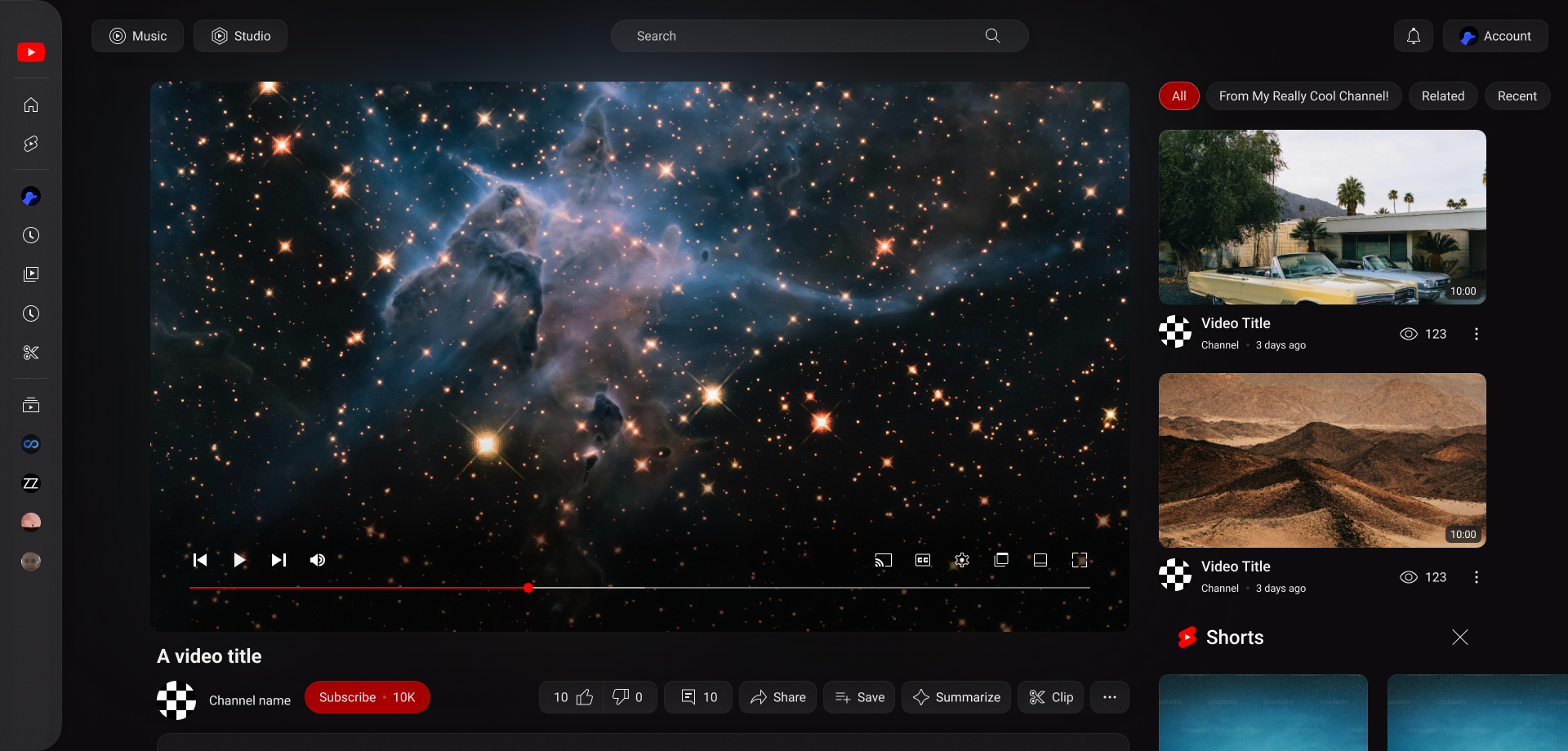
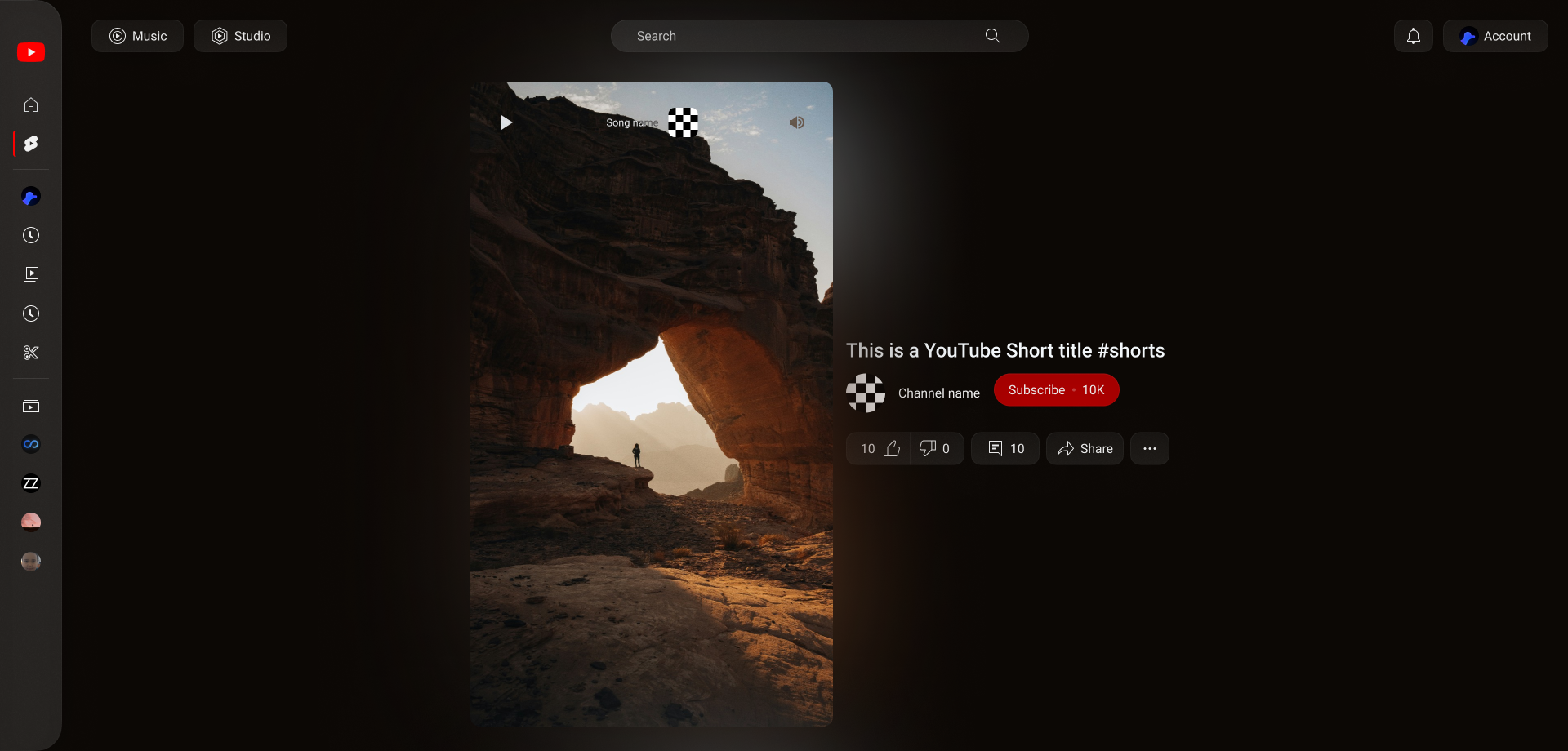
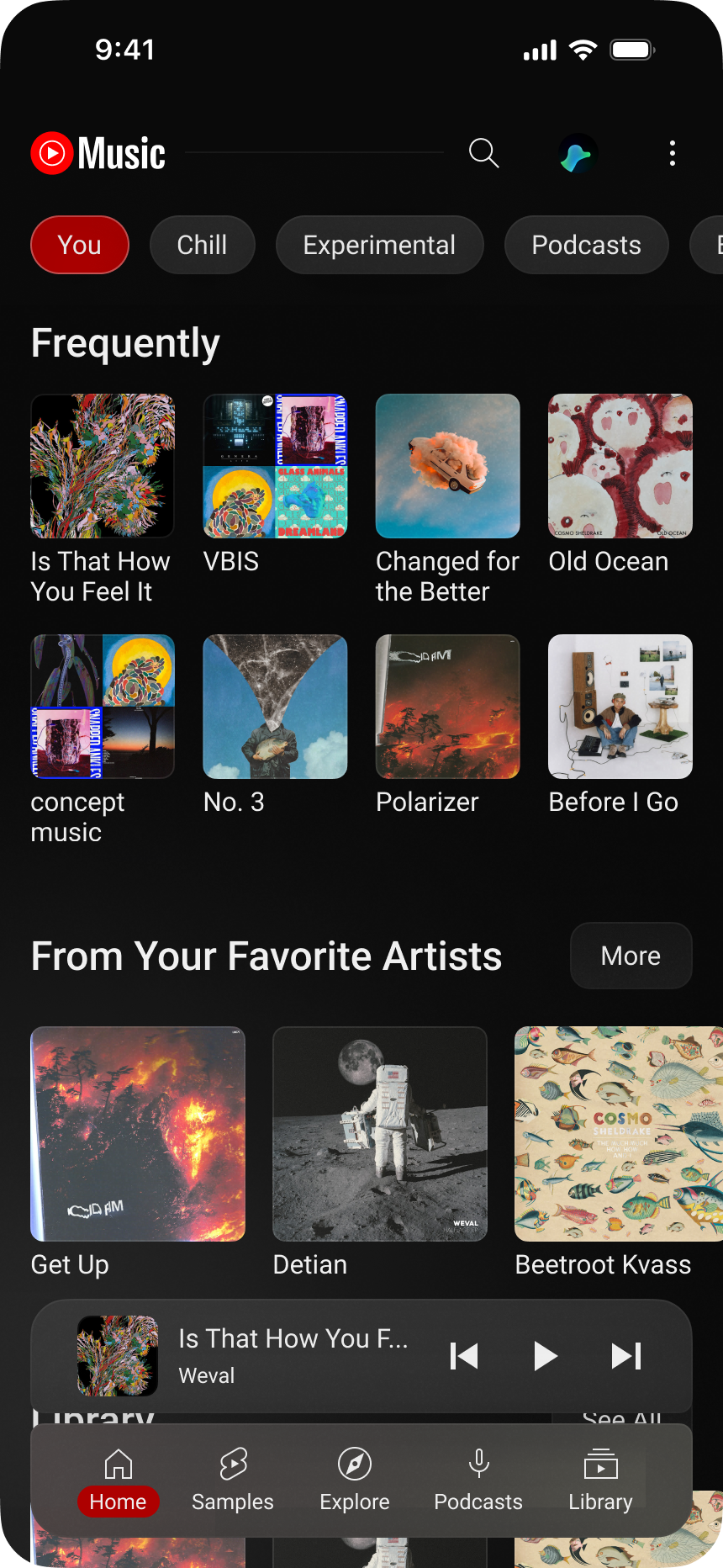
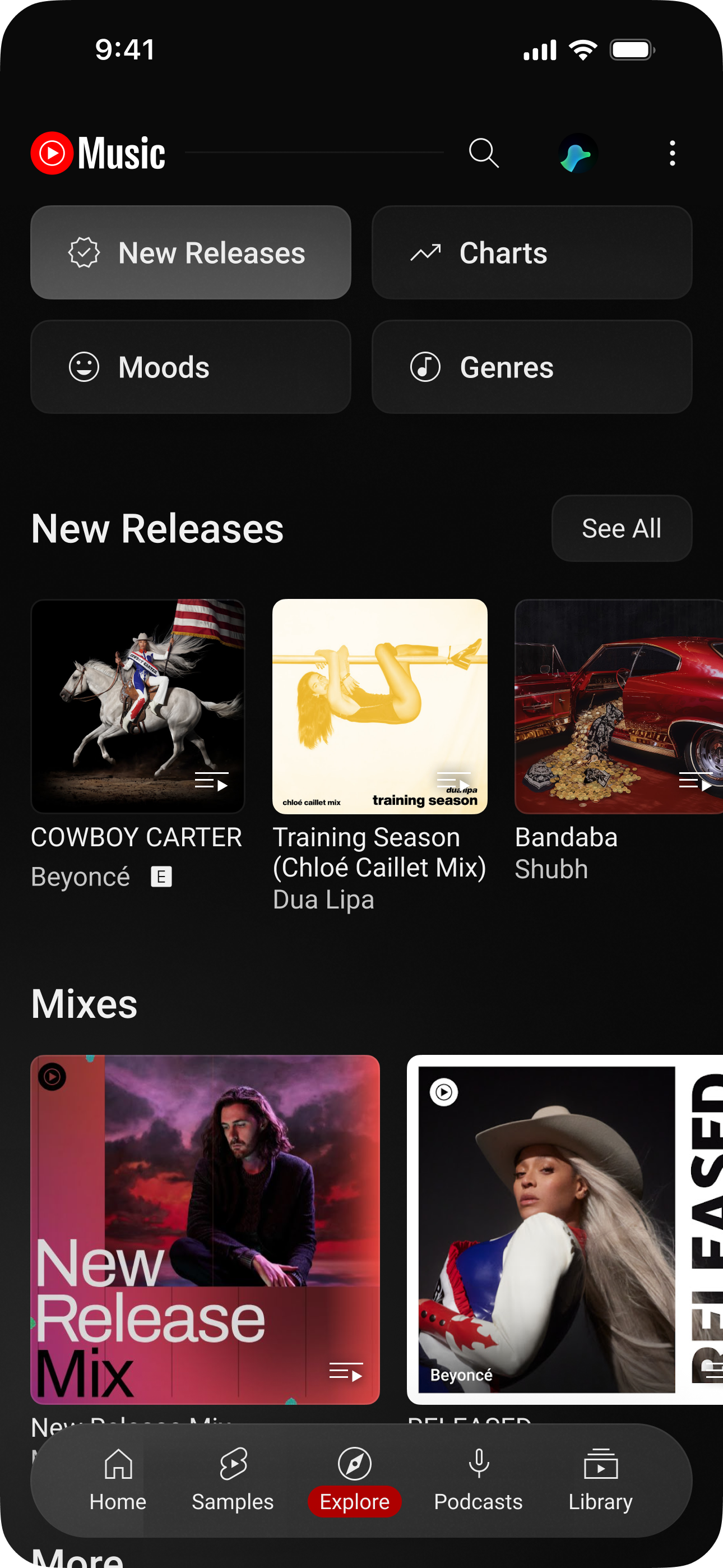
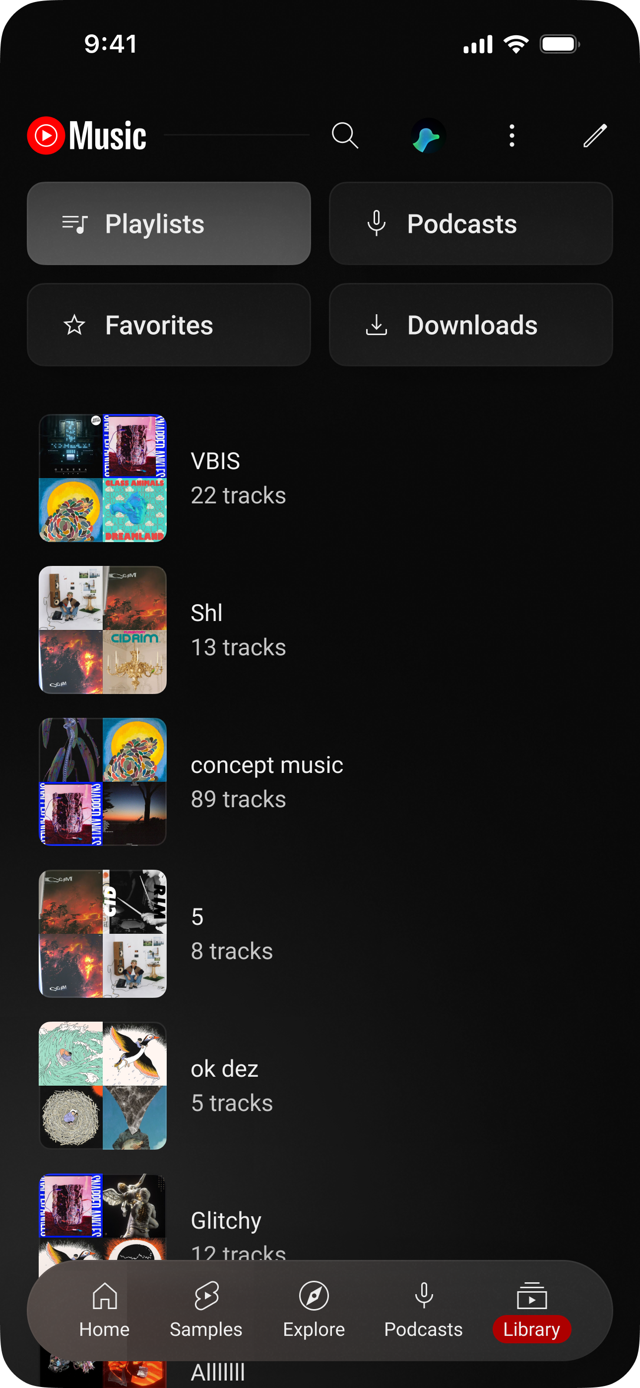
I redesigned YouTube with a glassmorphic, glowy, and dark design style. The redesign includes YouTube, YouTube Music, and YouTube Studio, since I noticed the 3 of their main services aren’t consistent. Fun fact, this project started as a school science fair project.
YouTube
A new glassmorphic design. You can now summarize a video with Gemini, right inside the app. On desktop, the video content and the side bar are different containers, and the comments open in the sidebar.
Music
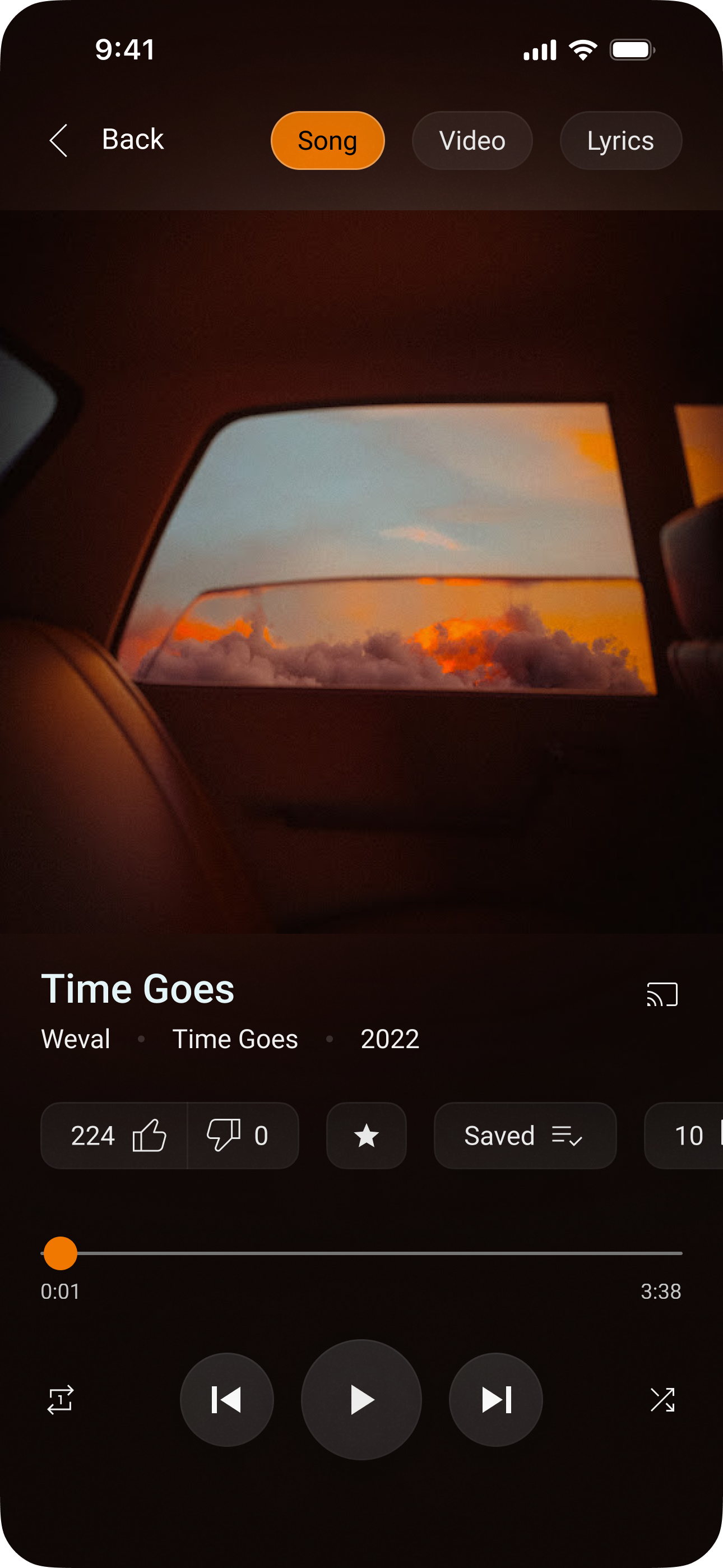
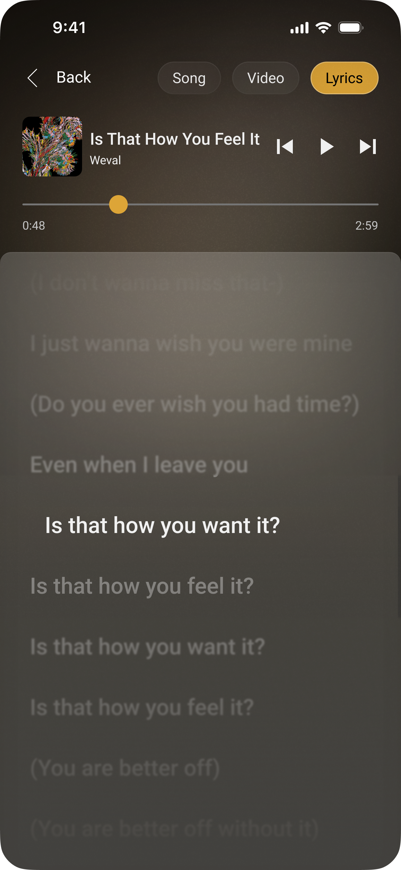
I tried to better organize the library. It now has tabs, with your playlists, podcasts, favorites, and downloads. The now playing UI now looks nicer, and it has a cool lyrics page. You can now create playlists, and recognize music inside the app with Gemini.
Studio
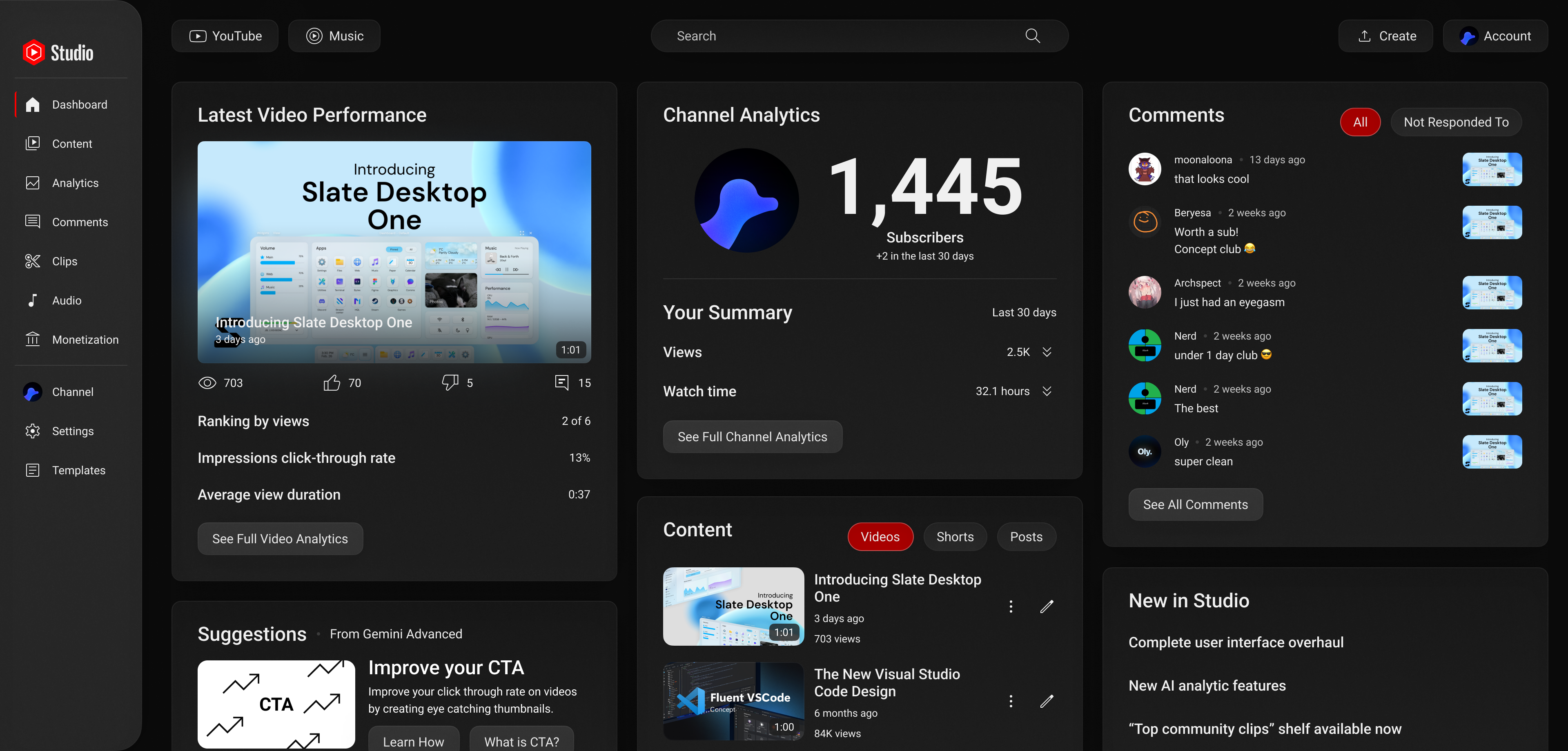
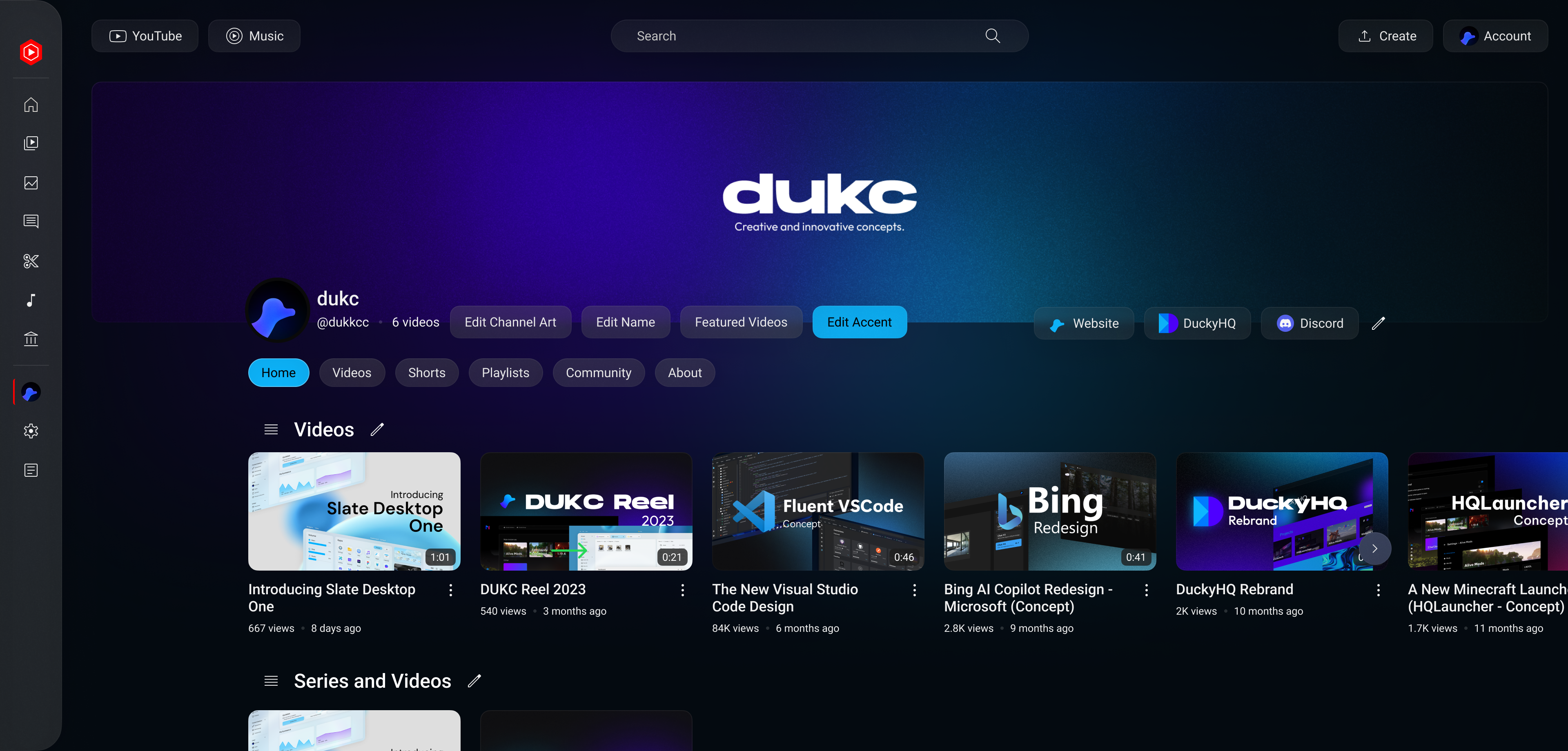
YouTube Studio now has a redesigned dashboard, and a brand new way to customize your channel. You can edit your accent, banner, social links, and channel layout while on the channel page. Gemini can help you analyze your analytics, and give you suggestions to help your channel out.
Designed with Figma, animated with After Effects
